
Highlight
iOS 14 lets UICollectionView create UITableView-style lists through
UICollectionLayoutListConfiguration, and configure adaptive height, separators, swipe actions, and accessories withUICollectionViewListCell.
Core Content
Many UIKit projects have an awkward dividing line: simple lists use UITableView, complex layouts use UICollectionView. Once a screen needs lists, horizontal scrolling regions, grids, or hierarchical structures together, developers switch between two systems and split data source and layout code.
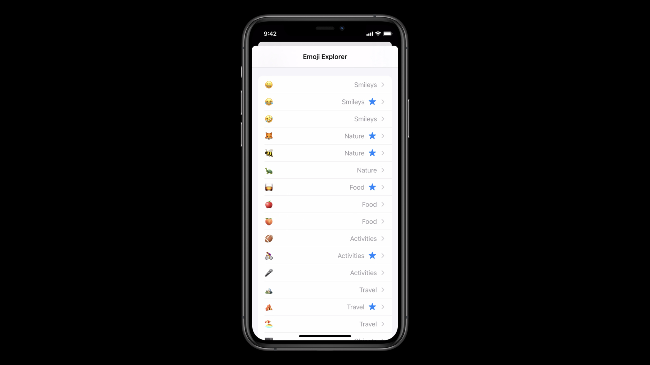
iOS 14 puts lists inside UICollectionView. UICollectionLayoutListConfiguration offers plain, grouped, inset-grouped, and iPad sidebar-oriented sidebar and sidebar plain appearances. Built on Compositional Layout, the same collection view can hold table-style lists, orthogonal scrolling regions, and custom grids.
List cells were redesigned too. UICollectionViewListCell supports default self-sizing height, separator layout guides, leading/trailing swipe actions, and declarable accessories. The presenter specifically warns: swipe actions should not capture index paths—after inserting or deleting content above, an old index path may point to different data.
This makes UICollectionView the default starting point for list screens. You can first replace the original table view appearance, then add horizontal regions, outlines, or iPad sidebars per section later.
Detailed Content
Create a list layout for the entire collection view
(03:47) The simplest entry is creating UICollectionLayoutListConfiguration and passing it to UICollectionViewCompositionalLayout.list(using:). This suits pages where all sections use the same list appearance.
// Simple setup

let configuration = UICollectionLayoutListConfiguration(appearance: .insetGrouped)
let layout = UICollectionViewCompositionalLayout.list(using: configuration)
Key points:
UICollectionLayoutListConfigurationis the new layout-side type for creating lists.appearance: .insetGroupedproduces an inset grouped table view-like appearance.UICollectionViewCompositionalLayout.list(using:)directly generates the entire collection view layout.
Mix lists and custom layouts per section
(04:40) If only some sections are lists, use Compositional Layout’s section provider. Each time the system requests a section layout, you can return a list section or custom section.
// Per section setup

let layout = UICollectionViewCompositionalLayout() {
    [weak self] sectionIndex, layoutEnvironment in
    guard let self = self else { return nil }

    // @todo: add custom layout sections for various sections

    let configuration = UICollectionLayoutListConfiguration(appearance: .insetGrouped)
    let section = NSCollectionLayoutSection.list(using: configuration, layoutEnvironment: layoutEnvironment)
    return section
}
Key points:
- The section provider receives
sectionIndexandlayoutEnvironmentand can return different layouts per section. NSCollectionLayoutSection.list(using:layoutEnvironment:)creates a list layout for only the current section.- Custom grids, horizontal scrolling regions, and lists can coexist in the same
UICollectionViewCompositionalLayout.
Explicitly enable headers and footers
(05:49) Headers and footers in lists must be explicitly enabled. Setting headerMode or footerMode to .supplementary makes the collection view request supplementary views from the data source or delegate.
var configuration = UICollectionLayoutListConfiguration(appearance: .insetGrouped)
configuration.headerMode = .supplementary
let layout = UICollectionViewCompositionalLayout.list(using: configuration)

dataSource.supplementaryViewProvider = { (collectionView, elementKind, indexPath) in
    if elementKind == UICollectionView.elementKindSectionHeader {
        return collectionView.dequeueConfiguredReusableSupplementary(using: header, for: indexPath)
    }
    else {
        return nil
    }
}
Key points:
.supplementarymeans the header is provided by a supplementary view.supplementaryViewProvidermust check forUICollectionView.elementKindSectionHeaderor the footer’s element kind.- The transcript explicitly warns: after enabling supplementary mode, returning
nilwhen a header/footer is requested triggers an assertion.
(07:07) Hierarchical data fits firstItemInSection better. It configures the section’s first item as a header appearance—good with section snapshots.
var configuration = UICollectionLayoutListConfiguration(appearance: .insetGrouped)
configuration.headerMode = .firstItemInSection
let layout = UICollectionViewCompositionalLayout.list(using: configuration)
Key points:
firstItemInSectionapplies only to headers.- In this mode, the first item in the data source represents the header, not ordinary content.
- The talk recommends it for hierarchical data structures and the new section snapshot API.
Configure swipe actions on cells
(11:40) In list cells, swipe actions are a cell capability. You set leadingSwipeActionsConfiguration or trailing configuration in the same place you configure content.
let cellRegistration = UICollectionView.CellRegistration<UICollectionViewListCell, Model> { (cell, indexPath, item) in
    // @todo configure the cell's content

    let markFavorite = UIContextualAction(style: .normal, title: "Mark as Favorite") {
        [weak self] (_, _, completion) in
        guard let self = self else { return }
        // trigger the action with a reference to the model
        self.markItemAsFavorite(with: item.identifier)
        completion(true)
    }
    cell.leadingSwipeActionsConfiguration = UISwipeActionsConfiguration(actions: [markFavorite])
}
Key points:
- Swipe actions are supported only when the cell renders in a section created by list configuration.
- The action handler captures
item.identifier, notindexPath. - This pattern pairs well with diffable data source stable item identifiers and iOS 14 cell registration.
Declare cell features with accessories
(14:55) UICollectionViewListCell accessories can be configured on leading or trailing sides; multiple accessories can sit on the same side. Some accessories trigger behavior—for example, the delete accessory shows trailing swipe actions.
let cellRegistration = UICollectionView.CellRegistration<UICollectionViewListCell, String> { (cell, indexPath, item) in
    // @todo configure the cell's content

    cell.accessories = [
        .disclosureIndicator(),
        .delete()
    ]
}
Key points:
cell.accessoriestakes an array ofUICellAccessory.- The system knows disclosure indicator belongs on trailing; delete accessory on leading.
- The delete accessory shows only in editing mode by default; UIKit handles enter/exit editing animations.
(15:51) Default accessory display rules can be adjusted with parameters. The disclosure indicator below shows only when not editing.
let cellRegistration = UICollectionView.CellRegistration<UICollectionViewListCell, String> { (cell, indexPath, item) in
    // @todo configure the cell's content

    cell.accessories = [
        .disclosureIndicator(displayed: .whenNotEditing),
        .delete()
    ]
}
Key points:
displayed: .whenNotEditingchanges the accessory’s display state.- This declarative configuration lets cells automatically switch between normal and editing states.
- Complex lists can handle navigation, delete, reorder, and outline expansion in the same cell accessory system.
Core Takeaways
- Migrate old table view lists to UICollectionView: Build a settings or favorites page with unchanged appearance. List configuration can reuse plain, grouped, and inset-grouped styles, then gradually add horizontal recommendation regions or grid sections.
- Build an iPad sidebar + content area for data management: Use sidebar or sidebar plain appearance for grouped navigation, fitting the iPadOS multi-column app scenario in the transcript. Start with list configuration for the navigation column, then add horizontal recent items or hierarchical groups per section.
- Add stable swipe actions to list items: Implement “mark favorite” or “archive” for mail, notes, or favorites. Configure
UIContextualActioninUICollectionView.CellRegistration; handlers capture model or stable identifier. - Replace hand-written editing controls with accessories: Add disclosure, delete, reorder, and other accessories for folders, task lists, or outlines. Set
cell.accessoriesfirst, then wire corresponding data source callbacks. - Mix information density per section: Put horizontal recent items at the top, outline in the middle, and ordinary list at the bottom on one page. The section provider can return grid, orthogonal scrolling layout, or
NSCollectionLayoutSection.list(using:layoutEnvironment:)per section.
Related Sessions
- Advances in UICollectionView — Higher-level introduction to iOS 14 collection view updates, including lists, cell registration, and section snapshots.
- Advances in diffable data sources — Deep dive on section snapshots, outline collection views, sidebars, and item-based reordering.
- Modern cell configuration — Supplements cell content/background configuration for use with list cell default content and state updates.
- Build for iPad — Multi-column iPad layouts, sidebars, and how lists fit in large-screen interfaces.
Comments
GitHub Issues · utterances