
Highlight
This session uses the Starstruck example to walk through
UIAccessibilitycheckpoints for Button Shapes, color differentiation, Bold Text, Reduce Motion, Cross-fade transitions, and Reduce Transparency—letting your app’s colors, text size, motion, and transparent backgrounds adapt to user visual preferences.
Core Content
Many apps build visual hierarchy from color: red for errors, blue for tappable elements, semi-transparent blur on light backgrounds. For sighted users these choices feel natural. For users with color blindness, low vision, light sensitivity, or motion sensitivity, the same interface can lose critical information.
This session follows a constellation app called Starstruck, splitting the problem into three groups: color and shape, text readability, and display preferences. The presenter does not treat accessibility as a final layer of labels—instead starting from everyday UI elements like buttons, tabs, list cells, images, animations, and blur, checking where default designs fail.
Apple’s approach is equally direct. Use system colors, SF Symbols, and high-contrast Asset Catalog resources to reduce manual adaptation; read user settings through UIAccessibility; if default design cannot satisfy those settings, observe notifications and switch to a clearer alternative. The result: the same interface can keep brand visuals while respecting visual needs users already expressed in system settings.
Detailed Content
Color and shape: don’t rely on color alone to convey meaning
(03:14) iOS 14 adds new UIAccessibility APIs for Button Shapes. The presenter’s advice: if your default design has no button outline, provide an alternative when this setting is on.
func observeButtonShapesNotification() {
    // Make buttons more visible by using shapes.
    // If your default design does not include button shapes, observe this notification to make visual changes.
    NotificationCenter.default.addObserver(self, selector: #selector(updateButtonShapes), name: UIAccessibility.buttonShapesEnabledStatusDidChangeNotification, object: nil)
}

@objc func updateButtonShapes() {
    if UIAccessibility.buttonShapesEnabled {
        // Use extra visualizations for buttons.
    } else {
        // Use default design for buttons.
    }
}
Key points:
buttonShapesEnabledStatusDidChangeNotificationlets the app update the interface immediately when the setting changes.UIAccessibility.buttonShapesEnabledis the current state—branch on it in update methods.- Alternatives should make buttons look more like buttons, e.g. borders, backgrounds, or other shape cues.
(03:31) Differentiate Without Color addresses a more common problem: status icons, colored text, and category markers in lists cannot rely on color alone. The presenter recommends starting with SF Symbols because symbols scale with text size and weight.
func observeDifferentiateWithoutColorNotification() {
    // Use symbols or shapes to convey meaning instead of relying on color alone.
    // If your default design does not differentiate without color, observe this notification to make visual changes.
    NotificationCenter.default.addObserver(self, selector: #selector(updateColorAndSymbols), name: NSNotification.Name(UIAccessibility.differentiateWithoutColorDidChangeNotification), object: nil)
}

@objc func updateColorAndSymbols() {
    if UIAccessibility.shouldDifferentiateWithoutColor {
        // Use symbols or shapes to convey meaning.
    } else {
        // Use default design.
    }
}
Key points:
- When
shouldDifferentiateWithoutColoris on, add symbols, shapes, or text alongside color. - This applies to error states, selection states, and category labels that originally relied on color.
- The Starstruck example in the transcript changes each constellation from color-only to color plus symbol, so color-blind users don’t lose category information.
Contrast and Smart Invert: let system settings drive appearance changes
(05:17) Color can still be used, but check contrast. The presenter demos Xcode Accessibility Inspector’s Color Contrast Calculator: white symbol on purple background is 4.5:1 in normal appearance; high-contrast resources darken the background to 7.5:1. Asset Catalog can provide a High Contrast appearance for the same symbol—Increase Contrast switches automatically.
(07:47) Smart Invert Colors inverts the interface, but photos, videos, and app icons should usually stay original. UIKit’s entry point is UIView.accessibilityIgnoresInvertColors.
extension UIView {
    @available(iOS 11.0, tvOS 11.0)
    var accessibilityIgnoresInvertColors: Bool { get set }
}
Key points:
- Set this property on any
UIViewsubclass. - Use it for photos, videos, app icons, and other content that should not be inverted.
- The transcript distinguishes Smart Invert from Dark Mode: Smart Invert is a system setting that overrides any app’s interface.
Large text: layout must follow content size
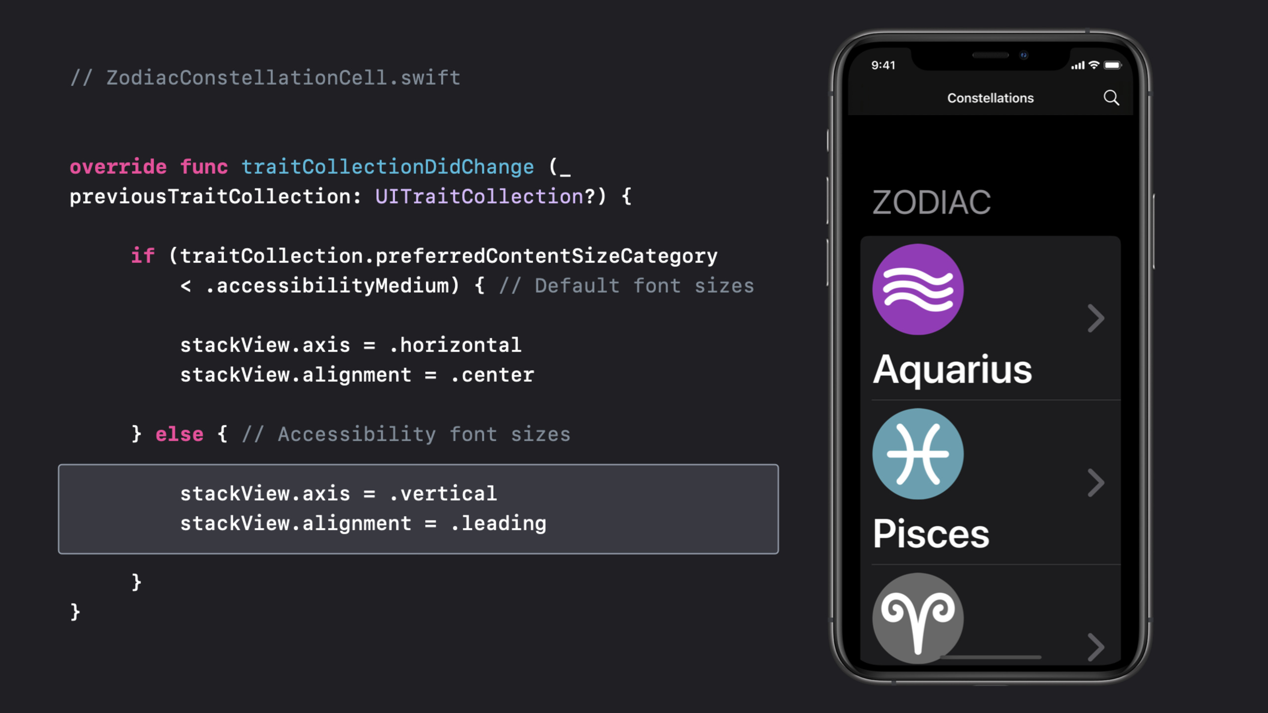
(09:57) Dynamic Type’s core issue isn’t just making fonts bigger. At accessibility sizes, horizontally arranged icons and text crowd each other. Starstruck reads preferredContentSizeCategory in traitCollectionDidChange and switches the cell from horizontal to vertical layout.
// ZodiacConstellationCell.swift


override func traitCollectionDidChange (_ previousTraitCollection: UITraitCollection?) {

     if (traitCollection.preferredContentSizeCategory
         < .accessibilityMedium) { // Default font sizes

         stackView.axis = .horizontal
         stackView.alignment = .center

     } else { // Accessibility font sizes

         stackView.axis = .vertical
         stackView.alignment = .leading

     }
}
Key points:
traitCollectionDidChangeis called when device display traits change.preferredContentSizeCategory < .accessibilityMediumdistinguishes default and accessibility font sizes.- Horizontal layout at default sizes keeps higher content density.
- Vertical layout at accessibility sizes gives labels full width.
- The transcript also stresses label line count should be
0so long text can wrap.
Bold Text: system fonts handle it automatically; custom fonts need your response
(11:33) System font styles handle Bold Text automatically. Custom fonts or weights need to read UIAccessibility.isBoldTextEnabled and observe the corresponding notification.
func observeBoldTextNotification() {
    // Update labels to use bold or heavy font styles.
    // If you aren't using system font styles, observe this notification to make visual changes.
    NotificationCenter.default.addObserver(self, selector: #selector(updateLabelWeight), name: UIAccessibility.boldTextStatusDidChangeNotification, object: nil)
}

@objc func updateLabelWeight() {
    if UIAccessibility.isBoldTextEnabled {
        // Use bold or heavy font weight
    } else {
        // Use font weight that is default to your design.
    }
}
Key points:
boldTextStatusDidChangeNotificationresponds to setting changes in real time.- When
isBoldTextEnabledis on, custom fonts should switch to bold or heavy. - The transcript usage gives title and detail labels clearer visual distinction.
Motion and transparency: respect user choices on movement and background complexity
(13:08) Starstruck has a parallax effect using UIMotionEffect to create depth between star foreground and cosmic background. For motion-sensitive users, such effects can cause discomfort. When Reduce Motion is on, reduce or remove frequent, intense, decorative motion.
func observeReduceMotionNotification() {
    // Observe this notification to reduce or remove the frequency and intensity of motion effects.
    NotificationCenter.default.addObserver(self, selector: #selector(updateMotionEffects), name: UIAccessibility.reduceMotionStatusDidChangeNotification, object: nil)
}

@objc func updateMotionEffects() {
    if UIAccessibility.isReduceMotionEnabled {
        // Reduce or remove extraneous motion effects.
    } else {
        // Use default motion effects.
    }
}
Key points:
- Check
isReduceMotionEnabledbefore running strong motion effects. reduceMotionStatusDidChangeNotificationlets open pages adjust motion too.- Alternatives include idle animation, parallax, auto-playing videos, GIFs, and slide transitions.
(13:51) iOS 14 also adds the Prefer Cross-Fade Transitions API. Default UINavigationController slide transitions are handled by the system; custom slide transitions need to check the setting.
func observeCrossFadeTransitionsNotification() {
    // Reduce or remove sliding animations for transitioning views.
    // If you aren't using system-provided navigation, observe this notification to make visual changes.
    NotificationCenter.default.addObserver(self, selector: #selector(updateTransitionEffects), name: UIAccessibility.prefersCrossFadeTransitionsStatusDidChange, object: nil)
}

@objc func updateTransitionEffects() {
    if UIAccessibility.prefersCrossFadeTransitions {
        // Replace sliding transitions with cross-fade animations.
    } else {
        // Use default sliding transitions.
    }
}
Key points:
- When
prefersCrossFadeTransitionsis on, replace slide transitions with cross-fade. - Default UIKit navigation already covers common paths.
- Custom transitions, game menus, and full-screen flows need explicit handling.
(15:07) Reduced Transparency adjusts blur and vibrancy to opaque effects. System visual effects adapt automatically; custom transparent backgrounds need to check UIAccessibility.isReduceTransparencyEnabled.
func observeReduceTransparencyNotification() {
    // Reduce or remove transparency by adjusting these effects to be completely opaque.
    // If you aren't using system-provided visual effects for blurs or vibrancy, observe this notification to make visual changes.
    NotificationCenter.default.addObserver(self, selector: #selector(updateTransparencyEffects), name: UIAccessibility.reduceTransparencyStatusDidChangeNotification, object: nil)
}

@objc func updateTransparencyEffects() {
    if UIAccessibility.isReduceTransparencyEnabled {
        // Make transparency effects opaque.
    } else {
        // Use default transparency.
    }
}
Key points:
- Blur backgrounds can make text contrast vary with background—harder for low-vision users.
reduceTransparencyStatusDidChangeNotificationsuits switching custom background materials.- Turning off transparency doesn’t mean losing hierarchy—use solid colors, borders, and spacing to preserve information structure.
Core Takeaways
-
Build an accessibility state component library. What to do: unify error, success, warning, and selection states as color plus symbol plus text. Why it’s worth doing: the session explicitly says don’t rely on color alone; SF Symbols scale with text size and weight. How to start: observe
differentiateWithoutColorDidChangeNotificationand show symbols or shapes whenshouldDifferentiateWithoutColoris on. -
Add large-text layouts for list cells. What to do: prepare an accessibility-size layout for message lists, order lists, and health data lists. Why it’s worth doing: Starstruck in the transcript switches icons and labels from horizontal to vertical so text gets full width. How to start: compare
preferredContentSizeCategoryin the cell’straitCollectionDidChange; beyond.accessibilityMedium, adjust stack view axis and alignment. -
Build a display-preferences test panel. What to do: list expected UI after Button Shapes, Bold Text, Reduce Motion, and Reduce Transparency in a debug menu. Why it’s worth doing: the session closing suggests developers open these settings themselves to find what already works and what needs fixing. How to start: wrap each
UIAccessibilitystate as a read-only check and link to per-page visual checklists. -
Replace high-risk motion effects. What to do: prepare low-motion versions for parallax, slide transitions, and auto-playing animation. Why it’s worth doing: parallax, idle animation, GIFs, and slide transitions can affect motion-sensitive users. How to start: check
isReduceMotionEnabledandprefersCrossFadeTransitionsbefore animation; replace decorative motion with fade or static states. -
Make blur backgrounds degradable. What to do: provide opaque backgrounds for info cards, bottom sheets, and semi-transparent navigation bars. Why it’s worth doing: Reduced Transparency turns system blur to solid color—custom blur needs your own handling. How to start: observe
reduceTransparencyStatusDidChangeNotification; whenisReduceTransparencyEnabledis on, switch to solid backgrounds and recheck text contrast.
Related Sessions
- App accessibility for Switch Control — Continue checking interaction structure from an accessibility angle, focusing on how Switch Control users scan and trigger interface elements.
- VoiceOver efficiency with custom rotors — How custom rotors help VoiceOver users navigate complex interfaces faster.
- Accessibility design for Mac Catalyst — When bringing iPad apps to Mac, add keyboard, mouse, element grouping, and Accessibility Inspector testing.
- The details of UI typography — Deep dive on text readability: system fonts, Dynamic Type, custom fonts, and typography details.
- SF Symbols 2 — Symbol system design and code usage, suited for Differentiate Without Color state expression.
Comments
GitHub Issues · utterances