
Highlight
Switch Control is a built-in iOS accessibility feature that lets users with limited mobility control an on-screen cursor with external switches. This session shows how to use
accessibilityNavigationStyle,accessibilityElements, focus callbacks, andUIAccessibilityCustomActionto reduce scanning wait time, automatically reveal card content, and move double-tap/long-press actions into the top-level menu.
Core Content
Switch Control users often operate devices through wheelchair-mounted switches, head taps, tongue taps, or sip-and-puff straws. The system moves a cursor between interface elements, and the user triggers a switch when the target element is selected. What touch users complete with a single tap can mean waiting, entering groups, opening menus, and choosing actions for switch users. (00:59)
This session frames the problem through a children’s learning game called Shape Shuffle. The game has curved level paths, cards to flip, and frequent double-taps and long-presses. Touch users find it natural; Switch Control users hit three barriers: wrong level scan order with long waits to reach distant levels; extra actions on every card to see its content; and double-tap and long-press buried in the gestures submenu. (05:15)
Apple’s approach is straightforward: first make the app fully VoiceOver-compatible, since many accessibility labels are reused by Switch Control; then add polish for switch users. Group levels with explicit order to reduce wait time, auto-flip cards on focus, and put common gestures into Custom Actions at the top level. (04:22)
The closing section reminds developers to factor motor-impaired users’ operational cost into product flows. High-consequence actions like account deletion or wiping all data need confirmation; verification and pairing code screens should not use short timeouts while Switch Control is running; screens with account, medical, or other private content should minimize prolonged exposure. (12:29)
Detailed Content
Control scan grouping and order
(07:49) Shape Shuffle levels follow a curved path, but Switch Control scans top-to-bottom, left-to-right by default. Developers can merge a group of levels into one scan group, then explicitly specify element order within the group.
containerView.accessibilityNavigationStyle = .combined

containerView.accessibilityElements = [levelFourView, levelFiveView, levelSixView]
Key points:
accessibilityNavigationStyle = .combinedmakes elements inside the container participate in scanning as one combined group, reducing top-level element count.accessibilityElementsoverrides default geometric ordering—useful for curved paths, boards, maps, and other layouts where visual order differs from reading order.- This directly addresses the wait problem for distant targets like level 30: users enter the correct group first, then move in the designed order within it.
Automatically reveal content on focus
(08:47) The card game relies on taps to flip cards. Manually scanning Switch Control users must trigger an extra action on every card they reach, and cost grows with card count. The session’s approach flips to the front when a card gains accessibility focus and back when it loses focus.
class CardView: UIView {
    var orientation: CardOrientation

    enum CardOrientation {
        case front
        case back
    }

    override func accessibilityElementDidBecomeFocused() {
        self.flip(to: .front)
    }

    override func accessibilityElementDidLoseFocus() {
        self.flip(to: .back)
    }

    // Rest of the class content...
}
Key points:
accessibilityElementDidBecomeFocused()is called when accessibility focus reaches the card.self.flip(to: .front)reveals content that normally requires a tap.accessibilityElementDidLoseFocus()restores the back when the card leaves focus, preserving game rules.- This behavior can be a user setting—the transcript notes auto-scan users may not need it, while manual-scan users benefit more.
Put common gestures in the top-level menu
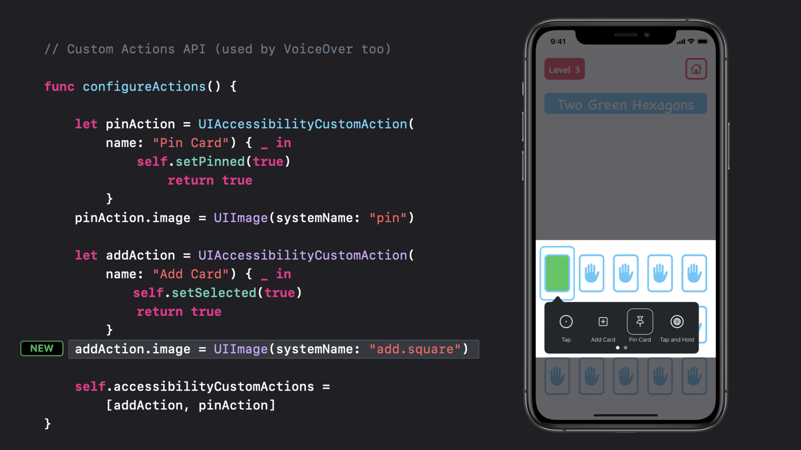
(09:15) Double-tap adds cards and long-press pins cards in the game. Switch Control users can perform these gestures, but must frequently enter the gestures submenu. UIAccessibilityCustomAction turns these common operations into top-level menu items, reducing menu depth.
func configureActions() {
    let pinAction = UIAccessibilityCustomAction(
        name: "Pin Card") { (_) -> Bool in
            self.setPinned(true)
            return true
        }
    pinAction.image = UIImage(systemName: "pin")

    let addAction = UIAccessibilityCustomAction(
        name: "Add Card") { (_) -> Bool in
            self.setSelected(true)
            return true
        }
    addAction.image = UIImage(systemName: "add.square")

    self.accessibilityCustomActions = [addAction, pinAction]
}
Key points:
- Each
UIAccessibilityCustomActioncorresponds to a user-triggerable behavior. - The closure returns
trueto indicate the action was handled. accessibilityCustomActionsdetermines which operations the current view exposes in the Switch Control menu.- iOS 14 allows setting an
imageon custom actions; the session uses SF Symbols for pin and add icons. Without an image, the menu shows the action name’s first letter.
Detect Switch Control and static text interaction
(11:41) The session also highlights two small APIs: one to check whether Switch Control is running, and another to include elements that look like static text but respond to taps in Switch Control navigation.
static var isSwitchControlRunning: Bool { get }

var accessibilityRespondsToUserInteraction: Bool { get set }
Key points:
isSwitchControlRunningsuits experience toggles aimed at Switch Control users, such as extending verification code page timeouts.- The transcript also mentions a corresponding notification for updating the UI when status changes.
accessibilityRespondsToUserInteractionsuits static-looking elements likeUILabelthat respond to taps.- Once set, Switch Control treats these elements as navigable targets, so users don’t miss hidden interactions.
Leave room for accidental taps and slow input
(12:44) Users with motor impairments may have tremors or other involuntary movements, raising accidental tap probability. High-consequence actions need confirmation; authentication and pairing code pages should avoid short timeouts while Switch Control is running; screens with account, medical, or other private information should dismiss sensitive content quickly.
Key points:
- Wipe all data, sign out, delete account, and similar actions need confirmation flows.
- Slower input and slower error correction are direct results of autoscanning—security flows cannot be designed only for touch-user speed.
- Devices may be mounted on wheelchairs, with weaker screen privacy than handheld use.
Core Takeaways
Switch-friendly card learning mode
What to do: Add a Switch Control mode to flashcards, language learning, or children’s cognitive games that automatically reveals content when focus reaches a card.
Why it’s worth doing: The session’s card example shows repeated tap-to-flip fatigues manual-scan users.
How to start: Implement accessibilityElementDidBecomeFocused() and accessibilityElementDidLoseFocus() on card UIViews, put flip logic in the focus lifecycle, and offer a setting to enable auto-flip.
Grouped scanning for levels, boards, and maps
What to do: Build scan groups for level maps, seat charts, game boards, or floor plans that follow task order.
Why it’s worth doing: Default top-to-bottom, left-to-right order breaks curved paths and spatial layouts, making users wait longer to reach targets.
How to start: Use a container view for a group of elements, set accessibilityNavigationStyle = .combined, and arrange accessibilityElements in the order users actually need to complete the task.
High-frequency actions in the top-level menu
What to do: Put pin, complete, favorite, add-to-answer, and similar high-frequency actions in the Switch Control top-level menu.
Why it’s worth doing: Double-tap, long-press, and swipe actions are reachable but repeatedly entering the gestures submenu slows the flow.
How to start: Create a UIAccessibilityCustomAction for each behavior, call existing business methods in the closure, and assign them to the element’s accessibilityCustomActions.
Verification flows without short timeouts
What to do: Use more generous time windows for login, pairing, and verification code pages while Switch Control is running.
Why it’s worth doing: Autoscanning users type slower and correct errors slower—short timeouts lock assistive technology users out of flows.
How to start: Read isSwitchControlRunning, extend countdowns in that state, pause auto-dismiss, or provide clear confirmation before resending.
Expose interactive labels for accessibility
What to do: Include stat items, status labels, or small controls that look like text but respond to taps in Switch Control navigation.
Why it’s worth doing: Switch Control needs to know they respond to user interaction, or users may scan past key entry points.
How to start: Set accessibilityRespondsToUserInteraction = true on these elements, and add labels, traits, and state feedback after triggering.
Related Sessions
- Make your app visually accessible — Check visual accessibility foundations from color, text size, Button Shapes, Smart Invert, and related settings.
- Create a seamless speech experience in your apps — Covers AVSpeechSynthesizer, assistive technology announcements, and speech output timing.
- VoiceOver efficiency with custom rotors — Use custom rotors to help VoiceOver users quickly jump to relevant content in complex interfaces.
- Accessibility design for Mac Catalyst — Discusses keyboard, mouse, element grouping, and Accessibility Inspector testing for Mac Catalyst apps.
- Build for the iPadOS pointer — Continue adapting interaction for mouse, trackpad, and other indirect input devices.
Comments
GitHub Issues · utterances