
Highlight
iPad and iPhone apps run on visionOS by default, but adding hover effects, tuning custom controls, and reviewing camera assumptions makes them feel native in the Shared Space.
核心内容
你花了几年时间打磨 iPad 应用。卡片布局、自定义播放器、精致的按钮样式,一切在 iPad 上都运行良好。现在用户会在 visionOS 的 Shared Space 中打开你的应用,用眼睛注视、手指轻触的方式与之交互。原有的触摸逻辑不会自动转化为空间交互体验。
visionOS 引入了全新的自然输入方式。用户注视一个按钮,然后手指轻触即可交互。系统控件(Button、Slider 等)会自动获得 hover effect,在注视时高亮反馈。但如果你的界面使用了自定义的 VStack + onTapGesture 组合,或者自定义形状的按钮,这些交互反馈就需要手动添加。
另一个容易忽视的问题是媒体处理。visionOS 拥有多个摄像头,但大部分不对应用开放。直接查询前后摄像头会得到与 iPhone 不同的结果。应用必须改用 discovery session 来检测可用的硬件。
这场演讲系统地梳理了从交互、视觉到媒体的适配要点,帮助开发者把”能运行”的 iPad 应用变成”感觉对”的 visionOS 应用。
交互适配:Hover Effect
在 visionOS 上,hover effect 是交互反馈的核心机制。当用户注视一个可交互元素时,系统会高亮该元素,帮助确认焦点位置。
系统控件自动处理 hover effect。如果你只使用标准控件,这部分无需改动。但自定义控件需要显式添加。
(02:26)演讲者展示了一个卡片应用。每张卡片是一个 VStack,内部包含图片、标题、时间和菜单按钮。菜单按钮是系统 Button,自动有 hover effect。但整个卡片通过 .onTapGesture 实现点击,没有 hover effect。用户注视卡片时,无法得知它是可点击的。
(03:02)解决方案是在 VStack 上添加 .hoverEffect() 修饰符。这样整个卡片在注视时会获得高亮反馈。
自定义形状的 Hover Effect
很多自定义视频播放器会扩大点击区域,让用户不必精确点击小按钮。在 iPad 上,跳过按钮的实际点击区域可能比图标大很多。
(03:49)在 visionOS 上,hover effect 会覆盖整个点击区域,暴露出一个巨大的高亮块,视觉上很突兀。
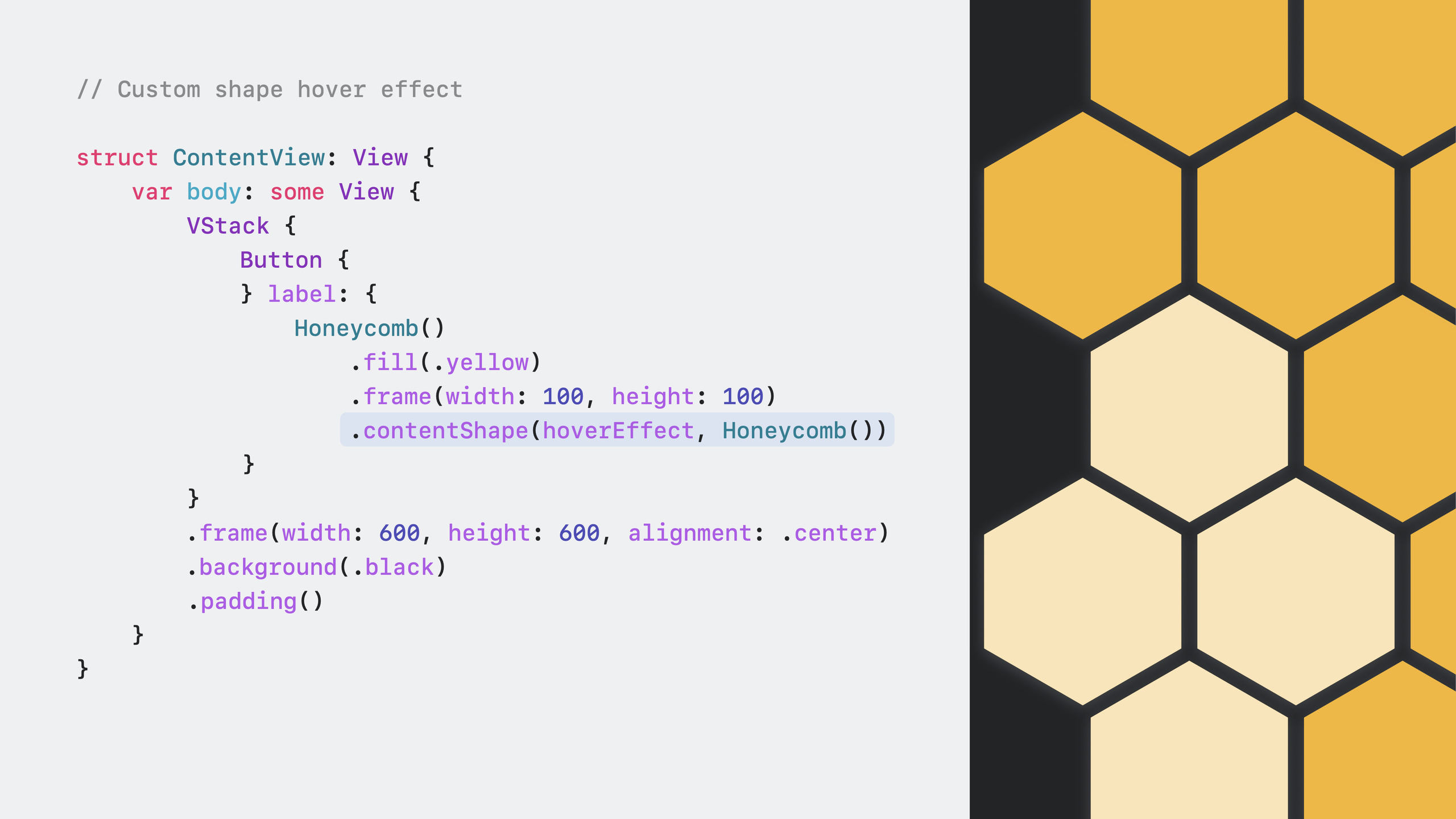
(04:09)解决方式是使用 .contentShape(.hoverEffect, shape) 将 hover effect 限制在更小的区域内,同时保留更大的点击区域。这样用户看到的高亮区域与按钮图标匹配,但点击范围仍然宽松。
自定义 ButtonStyle 与 Hover Effect
使用 .buttonStyle 自定义按钮样式时,hover effect 会被关闭。需要手动重新添加。
(05:14)演讲者展示了一个彩虹条纹背景的自定义按钮。在自定义的 ButtonStyle 实现中,需要在返回的视图链上追加 .hoverEffect()。
媒体处理注意事项
visionOS 的摄像头配置与 iPhone 不同。应用不能假设前后摄像头都可用。
(09:48)查询麦克风时,系统返回一个 .front 位置的麦克风。查询摄像头时,有两个结果:.back 摄像头返回黑屏(带无摄像头图标),这是一个非功能性占位摄像头,用于兼容假设后摄像头存在的应用;.front 摄像头是一个复合摄像头,如果没有设置 spatial persona,则不会返回帧。
(10:42)AVRoutePickerView 和 Picture in Picture 在 visionOS 上不可用。自定义播放器需要检查这两个控件的可用性再决定是否显示。
(10:55)设备摘下后会锁定。使用后台音频的应用需要注意,锁定后不再获得后台模式,应用会被完全挂起。
详细内容
为 VStack 卡片添加 Hover Effect
struct TappableCard: View {
   var imageName = "BearsInWater"
   var headline = "Bear Fishing"
   var timeAgo = "42 Minutes ago"

   var body: some View {
      VStack {
         VStack(alignment: .leading) {
            Image(imageName)
               .resizable()
               .clipped()
               .aspectRatio(contentMode: .fill)
               .frame(width: 300, height: 250, alignment: .center)
            Text(headline)
               .padding([.leading])
               .font(.title2)
               .foregroundColor(.black)
         }
         Divider()
         HStack {
            HStack {
               Text(timeAgo)
                  .frame(alignment: .leading)
                  .foregroundColor(.black)
            }
            .padding([.leading])
            Spacer()
            VStack(alignment: .trailing) {
               Button { print("Present menu options") } label: {
                  Image(systemName: "ellipsis")
                     .foregroundColor(.black)
               }
            }
         }
         .padding(EdgeInsets(top: 5, leading: 5, bottom: 5, trailing: 5))
      }
      .frame(width: 300, height: 350, alignment: .top)
      .hoverEffect()  // 让整个卡片获得 hover 反馈
      .background(.white)
      .overlay(
         RoundedRectangle(cornerRadius: 10)
            .stroke(Color(.sRGB, red: 150/255, green: 150/255, blue: 150/255, opacity: 0.1), lineWidth: 3.0)
      )
      .cornerRadius(10)
      .onTapGesture {
         print("Present card detail")
      }
   }
}
关键点:
.hoverEffect()加在 VStack 上,让整个卡片在注视时高亮- 系统 Button(菜单按钮)自动有 hover effect,无需额外处理
.onTapGesture保留在 VStack 上,点击行为不变
自定义 Hover Effect 区域
struct ContentView: View {
   var body: some View {
      VStack {
         HStack {
            Button { print("Going back 10 seconds") } label: {
               Image(systemName: "gobackward.10")
                  .padding(.trailing)
                  .contentShape(.hoverEffect, CustomizedRectShape(
                     customRect: CGRect(x: -75, y: -40, width: 100, height: 100)
                  ))
                  .foregroundStyle(.white)
                  .frame(width: 500, height: 834, alignment: .trailing)
            }
            Button { print("Play") } label: {
               Image(systemName: "play.fill")
                  .font(.title)
                  .foregroundStyle(.white)
                  .frame(width: 100, height: 100, alignment: .center)
            }
            .padding()
            Button { print("Going into the future 10 seconds") } label: {
               Image(systemName: "goforward.10")
                  .padding(.leading)
                  .contentShape(.hoverEffect, CustomizedRectShape(
                     customRect: CGRect(x: 0, y: -40, width: 100, height: 100)
                  ))
                  .foregroundStyle(.white)
                  .frame(width: 500, height: 834, alignment: .leading)
            }
         }
         .frame(minWidth: 0, maxWidth: .infinity, minHeight: 0, maxHeight: .infinity, alignment: .center)
      }
      .frame(minWidth: 0, maxWidth: .infinity, minHeight: 0, maxHeight: .infinity, alignment: .topLeading)
      .background(.black)
   }
}

struct CustomizedRectShape: Shape {
   var customRect: CGRect

   func path(in rect: CGRect) -> Path {
      var path = Path()
      path.move(to: CGPoint(x: customRect.minX, y: customRect.minY))
      path.addLine(to: CGPoint(x: customRect.maxX, y: customRect.minY))
      path.addLine(to: CGPoint(x: customRect.maxX, y: customRect.maxY))
      path.addLine(to: CGPoint(x: customRect.minX, y: customRect.maxY))
      path.addLine(to: CGPoint(x: customRect.minX, y: customRect.minY))
      return path
   }
}
关键点:
.contentShape(.hoverEffect, shape)将 hover effect 限制在自定义形状内- 按钮的
frame仍然很大,保留了宽松的点击区域 CustomizedRectShape定义了 hover effect 的可见边界
自定义 ButtonStyle 重新启用 Hover Effect
struct ContentView: View {
    var body: some View {
        VStack {
         Button("Howdy y'all") { print("🤠") }
            .buttonStyle(SixColorButton())
        }
        .padding()
    }
}

struct SixColorButton: ButtonStyle {
   func makeBody(configuration: Configuration) -> some View {
      configuration.label
         .padding()
         .font(.title)
         .foregroundStyle(.white)
         .bold()
         .background {
            ZStack {
               Color.black
               HStack(spacing: 0) {
                  Rectangle()
                     .foregroundStyle(Color(red: 125/255, green: 186/255, blue: 66/255))
                     .frame(width: 16)
                  Rectangle()
                     .foregroundStyle(Color(red: 240/255, green: 187/255, blue: 64/255))
                     .frame(width: 16)
                  Rectangle()
                     .foregroundStyle(Color(red: 225/255, green: 137/255, blue: 50/255))
                     .frame(width: 16)
                  Rectangle()
                     .foregroundStyle(Color(red: 200/255, green: 73/255, blue: 65/255))
                     .frame(width: 16)
                  Rectangle()
                     .foregroundStyle(Color(red: 134/255, green: 64/255, blue: 151/255))
                     .frame(width: 16)
                  Rectangle()
                     .foregroundStyle(Color(red: 75/255, green: 154/255, blue: 218/255))
                     .frame(width: 16, height: 500)
               }
               .opacity(0.7)
               .rotationEffect(.degrees(35))
            }
         }
         .cornerRadius(10)
         .hoverEffect()  // 自定义样式后需要手动添加
   }
}
关键点:
- 自定义
ButtonStyle会关闭系统默认的 hover effect - 在
makeBody返回的视图链末尾添加.hoverEffect()恢复反馈
自定义形状按钮的 Hover Effect
struct ContentView: View {
    var body: some View {
      VStack {
         Button { print("🐝") } label: {
            HoneyComb()
               .fill(.yellow)
               .frame(width: 300, height: 300)
               .contentShape(.hoverEffect, HoneyComb())
            }
         }
         .frame(width: 400, height: 400, alignment: .center)
         .background(.black)
         .padding()
      }
    }
}

struct HoneyComb: Shape {
   func path(in rect: CGRect) -> Path {
      var path = Path()
      path.move(to: CGPoint(x: rect.minX + (rect.width * 0.25), y: rect.minY))
      path.addLine(to: CGPoint(x: rect.maxX - (rect.maxX * 0.25), y: rect.minY))
      path.addLine(to: CGPoint(x: rect.maxX, y: rect.midY))
      path.addLine(to: CGPoint(x: rect.maxX - (rect.maxX * 0.25), y: rect.maxY))
      path.addLine(to: CGPoint(x: rect.minX + (rect.width * 0.25), y: rect.maxY))
      path.addLine(to: CGPoint(x: rect.minX, y: rect.midY))
      path.addLine(to: CGPoint(x: rect.minX + (rect.width * 0.25), y: rect.minY))
      return path
   }
}
关键点:
.contentShape(.hoverEffect, HoneyComb())让 hover effect 贴合六边形边界- 不加这个修饰符时,hover effect 会覆盖整个 frame 矩形区域
- 自定义 Shape 的
path(in:)方法定义了 hover effect 的裁剪边界
核心启发
1. 为所有自定义可交互元素添加 Hover Effect
如果你的应用使用了 onTapGesture、DragGesture 或其他手势修饰符的自定义视图,检查是否添加了 .hoverEffect()。没有视觉反馈的空间交互会让用户困惑。入口:在自定义视图的根容器上添加 .hoverEffect()。
2. 优化媒体相关功能的硬件检测
如果你的应用涉及拍照、录像、扫码或音频录制,将硬编码的摄像头/麦克风查询替换为 AVCaptureDevice.DiscoverySession。visionOS 的摄像头配置与 iPhone 完全不同,直接假设前后摄像头可用会导致功能异常。入口:用 discovery session 枚举可用设备,并为无可用设备的情况提供替代方案(如文档选择器、iCloud)。
3. 为游戏添加控制器支持
visionOS 的双手注视+轻触交互适合慢节奏操作,但游戏往往需要快速、并发的输入。在 Info.plist 中添加 GCSupportsControllerUserInteraction,并启用 Game Controller capability。这会在 App Store 产品页上显示控制器支持徽章,帮助玩家发现你的游戏。入口:GameController 框架 + Info.plist 配置。
4. 检查后台音频假设
visionOS 设备摘下后即锁定,后台音频模式不再生效。如果你的应用依赖后台播放(如音乐播放器、播客应用),需要重新考虑用户体验。入口:在应用进入后台时保存播放状态,并在返回前台时恢复。
关联 Session
- Build great games for spatial computing — 了解 visionOS 游戏开发中的输入方式选择,包括控制器、手势和注视轻触
- Explore rendering for spatial computing — 深入学习 RealityKit 渲染、光照和阴影,让 3D 内容融入真实环境
- Meet RealityKit Trace — 使用 Instruments 的 RealityKit Trace 模板分析和优化空间计算应用性能
评论
GitHub Issues · utterances