
Highlight
Apple 在 WWDC 2020 将 UI 排版落到一组可执行 API:SF Pro 迁移到 variable fonts,系统自动同步 optical size;UIKit、AppKit 和 SwiftUI 补齐 text style、leading 与 system design 入口,UIKit 和 SwiftUI 继续完善自定义字体的 Dynamic Type 支持。
核心内容
(00:37)很多 App 的排版问题常常等到真实设备上才暴露:同一段文字到了小字号变糊,按钮标题差几个像素就截断,用户把 Dynamic Type 调大后,自定义字体的标题和内边距没有一起变化。开发者表面上只是在选字体和字号,实际要处理 optical size、tracking、leading、text style 和 accessibility 设置之间的联动。
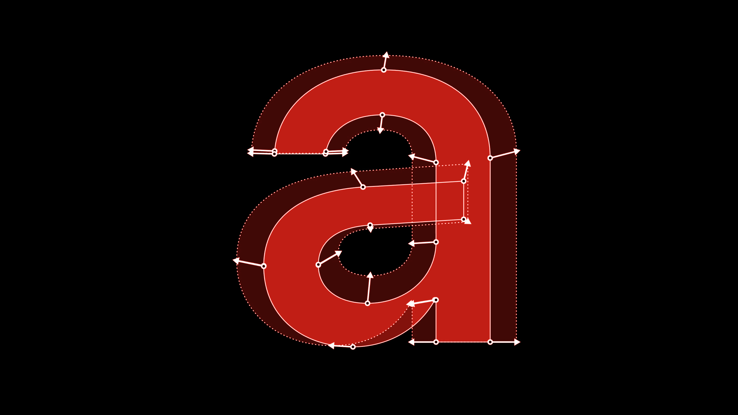
(01:47)Apple 先解释 San Francisco(SF)为什么有 SF Text 和 SF Display。20 pt 以下的小字号需要更宽的字距和更稳的细节,20 pt 以上的大字号可以保留更多视觉性。2020 年的变化是 SF Pro 开始转向 variable fonts(可变字体),字体内部用 optical size axis 表达尺寸变化,系统在代码里自动把 point size 和 optical size 对齐。(06:31)
(09:22)这件事直接影响 UI 布局。tracking 不是 kerning;tracking 是整段文本的字距调整,kerning 是字偶之间的微调。标题快要被截断时,用 kerning API 硬挤文本会让 ligature 保持原样,节奏会坏掉。使用 tracking API 或允许系统自动 tightening,系统可以按字号使用合适的 tracking table,并在必要时拆开 ligature。
(16:11)后半段把这些原则接到 UIKit、AppKit 和 SwiftUI。Text styles(文本样式)把字号、字重和行高组合成系统层级;Dynamic Type(动态字体)让这些组合跟随用户偏好缩放。自定义字体也不需要放弃 accessibility:UIKit 用 UIFontMetrics,SwiftUI 在 iOS 14 里让 .custom 默认按 body 缩放,并用 relativeTo 指定目标文本样式。(25:10)
详细内容
Tracking:用正确的 API 处理字距和截断
(12:19)如果要手动调整整段文字的字距,UIKit 侧使用 Core Text 的 tracking attribute,SwiftUI 侧使用 .tracking()。session 特别提醒,不要把这种需求误当成 kerning。
// UIKit
label.attributedText =
    NSAttributedString(string: "hamburgefonstiv",
        attributes: [kCTTrackingAttributeName as NSAttributedString.Key: -0.5])

// SwiftUI
Text("hamburgefonstiv").tracking(-0.5)
关键点:
kCTTrackingAttributeName表达的是整段文字的 tracking,不是某两个字符之间的 kerning。-0.5会收紧字符间距;这个值应按字号验证,不能拿小字号的值直接套到大标题。- SwiftUI 的
.tracking(-0.5)是同一类语义,适合少量需要精细调整的文本。
(12:45)更常见的截断场景应该交给系统。allowsDefaultTighteningForTruncation 和 .allowsTightening(true) 会使用系统字体中的 tight tracking table,在可读范围内尝试让字符串放下。
// UIKit: UILabel
label.allowsDefaultTighteningForTruncation = true

// AppKit: NSTextField
textField.allowsDefaultTighteningForTruncation = true

// SwiftUI
Text("hamburgefonstiv").allowsTightening(true)
关键点:
- UIKit、AppKit 和 SwiftUI 都有对应入口,适合按钮、标签、导航标题这类空间紧张的文本。
- 系统会控制 tightening 的范围;超出合理范围时,截断仍然是更好的结果。
- 这条路径会得到 size-specific tracking,开发者不用自己维护 tracking table。
Text styles:从系统层级拿到强调和行高变体
(17:45)Text style 不只是字号。要做 emphasized title1,可以先拿 preferredFontDescriptor(withTextStyle:),再叠加 bold symbolic trait。实际映射到 medium、semibold、bold 还是 heavy,由系统按 text style 决定。
// Getting emphasized text styles

let label = UILabel()
label.text = "Ready. Set. Code."

if let descriptor = UIFontDescriptor
    .preferredFontDescriptor(withTextStyle: .title1)
    .withSymbolicTraits(.traitBold) {
    // 28 pt Bold on iOS
    label.font = .init(descriptor: descriptor, size: 0)
}
关键点:
preferredFontDescriptor(withTextStyle: .title1)保留了 title1 的系统尺寸和 Dynamic Type 行为。.withSymbolicTraits(.traitBold)请求强调变体,不等于固定指定某个字重数值。size: 0表示使用 descriptor 里的系统尺寸,不手动覆盖字号。
(20:03)行高也可以从 text style 派生。tight leading 适合信息密度更高的界面,loose leading 适合长段阅读;session 中的例子显示 body 文本从 22 pt 行高变到 20 pt 或 24 pt。
// Getting tight/loose leading variant

// AppKit
let descriptor = NSFontDescriptor.preferredFontDescriptor(forTextStyle: .headline)
    .withSymbolicTraits(.tightLeading) // Use .looseLeading for loose leading font
let tightLeadingFont = NSFont(descriptor: descriptor, size: 0) // 14 pt line height

// UIKit/Catalyst
if let descriptor = UIFontDescriptor.preferredFontDescriptor(withTextStyle: .title1)
    .withSymbolicTraits(.traitTightLeading) { // Use .traitLooseLeading for loose leading
    let tightLeadingFont = UIFont(descriptor: descriptor, size: 0) // 36 pt line height
}

// SwiftUI
// Use .loose for loose leading font
let tightLeadingFootnoteFont = Font.footnote.leading(.tight) // 16 pt line height on iOS
关键点:
- AppKit 使用
.tightLeading或.looseLeading,UIKit/Catalyst 使用.traitTightLeading或.traitLooseLeading。 - SwiftUI 用
.leading(.tight)或.leading(.loose)接到系统 text style。 - tight leading 不适合所有长文本;session 在 19:43 明确展示 body 段落过紧时阅读感会变差。
System designs:保留 text style,只替换字体气质
(20:56)SF Pro Rounded、New York 和 SF Mono 可以跟 text style 一起工作。对 UIKit 来说,做法是从现有 text style descriptor 出发,再调用 .withDesign(.rounded);这样字体设计变了,字号、字重和行高仍沿用系统样式。
// Access rounded system font design
import UIKit

let label = UILabel()
label.text = "Today"

if let descriptor = UIFontDescriptor
    .preferredFontDescriptor(withTextStyle: .largeTitle)
    .withSymbolicTraits(.traitBold)?
    .withDesign(.rounded) {
    // SF Pro Rounded Bold
    label.font = UIFont(descriptor: descriptor, size: 0)
}
关键点:
.preferredFontDescriptor(withTextStyle: .largeTitle)先确定系统层级。.withSymbolicTraits(.traitBold)得到 emphasized large title。.withDesign(.rounded)把设计切到 SF Pro Rounded,但保留 large title 的尺寸、字重语义和行高。
(21:08)同一能力在 AppKit、UIKit/Catalyst 和 SwiftUI 里都有入口。SwiftUI 要在构造 font 时传入 design,而不是把已有 font 再转换一次。
// Access system font designs

// Use .serif for New York, .monospaced for SF Mono

// AppKit
let descriptor = NSFontDescriptor.preferredFontDescriptor(forTextStyle: .body)
    .withDesign(.rounded)
let roundedBodyFont = NSFont(descriptor: descriptor, size: 0) // SF Pro Rounded

// UIKit/Catalyst
if let descriptor = UIFontDescriptor.preferredFontDescriptor(withTextStyle: .body)
    .withDesign(.rounded) {
    let roundedBodyFont = UIFont(descriptor: descriptor, size: 0) // SF Pro Rounded
}

// SwiftUI
let roundedBodyFont = Font.system(.body, design: .rounded) // SF Pro Rounded
关键点:
.serif对应 New York,.monospaced对应 SF Mono,.rounded对应 SF Pro Rounded。- UIKit/Catalyst 和 AppKit 都从 font descriptor 进入。
- SwiftUI 的
Font.system(.body, design: .rounded)同时声明 text style 和 design。
Dynamic Type:让自定义字体和布局一起缩放
(25:05)UIKit 从 iOS 11 开始提供 UIFontMetrics。它把某个 text style 的 Dynamic Type 缩放曲线应用到任意自定义字体,也能缩放布局常量。
// Support Dynamic Type with custom font in UIKit

if let customFont = UIFont(name: "Charter-Roman", size: 17) {
    let bodyMetrics = UIFontMetrics(forTextStyle: .body)

    // Charter-Roman scaled relative to body text style
    // in different content size categories.
    let customFontScaledLikeBody = bodyMetrics.scaledFont(for: customFont)
    label.font = customFontScaledLikeBody
    label.adjustsFontForContentSizeCategory = true

    // Scaling constant 10 relative to body text style.
    let scaledValue = bodyMetrics.scaledValue(for: 10)
}
关键点:
UIFontMetrics(forTextStyle: .body)选择 body 的缩放行为,不只是拿一个固定倍率。scaledFont(for:)让Charter-Roman跟随用户的文字大小设置。adjustsFontForContentSizeCategory = true让 label 在设置变化时继续响应。scaledValue(for:)适合把间距、padding 这类布局常量同步放大。
(26:25)SwiftUI 在 iOS 14 改进了自定义字体缩放。.custom(_:size:relativeTo:) 可以指定按哪个 text style 缩放;省略 relativeTo 时,默认按 body 缩放。@ScaledMetric 则把布局值接到同一套文字大小设置。
struct ContentView: View {
    let prose = "Apple provides two type families you can use in your iOS apps. San Francisco (SF). San Francisco is a sans serif type family that includes SF Pro, SF Pro Rounded, SF Mono, SF Compact, and SF Compact Rounded."
    @ScaledMetric(relativeTo: .body) var padding: CGFloat = 20

    var body: some View {
        VStack {
            Text("Typography")
                .font(.custom("Avenir-Medium", size: 34, relativeTo: .title))
            Text(prose)
                .font(.custom("Charter-Roman", size: 17))
                .padding(padding)
        }
    }
}
关键点:
- 标题用 Avenir-Medium,但通过
relativeTo: .title使用 title 的缩放曲线。 - 正文用 Charter-Roman,省略
relativeTo后按 body 缩放。 @ScaledMetric(relativeTo: .body)让 padding 跟正文尺寸一起变化,避免大字号时文本贴边。
核心启发
-
品牌字体的阅读页:做一个支持 Dynamic Type 的文章或说明页,让品牌字体随用户文字大小变化。为什么值得做:session 明确把 custom font 和 accessibility 连接起来。怎么开始:UIKit 用
UIFontMetrics(forTextStyle:)包装自定义字体,SwiftUI 用.custom(_:size:relativeTo:)和@ScaledMetric同步字体与 padding。 -
截断敏感的按钮和导航标题:为短按钮、标签和导航栏标题开启系统 tightening,而不是手写 kerning。为什么值得做:系统会使用 tight tracking table,并在可读范围内调整。怎么开始:UIKit/AppKit 设置
allowsDefaultTighteningForTruncation,SwiftUI 设置.allowsTightening(true),再用最长本地化文案测试。 -
小屏信息密度模式:给 watchOS、widget 或紧凑卡片准备 tight leading 版本。为什么值得做:session 用 watchOS 和 Fitness 的例子说明 tight leading 可以提升单位屏幕的信息量。怎么开始:优先使用系统 text style,再在 SwiftUI 中试
.leading(.tight),长段正文保留默认或 loose leading。 -
有品牌感但不破坏层级的系统字体方案:在提醒、记账、阅读类 App 里用 rounded、serif 或 monospaced design 表达不同内容气质。为什么值得做:
.withDesign和Font.system(_:design:)会保留 text style 的字号、字重和行高。怎么开始:标题尝试.rounded,正文阅读尝试.serif,金额或编号尝试.monospaced。 -
排版回归检查清单:把 optical size、tracking、leading 和 Dynamic Type 放进 UI QA。为什么值得做:session 的核心问题都发生在真实尺寸、真实语言和真实用户设置下。怎么开始:每个关键界面至少检查小字号、大标题、最大辅助功能字号、长本地化字符串和阿拉伯语等高行高语言。
关联 Session
- SF Symbols 2 — SF Symbols 与 San Francisco 字体共享视觉系统,适合继续看 symbol、文本样式和多框架 API 的配合方式。
- Make your app visually accessible — 从可读文本、视觉设置和 accessibility 角度补齐排版在真实用户设置下的检查项。
- Design great widgets — widget 的信息必须快速扫读,里面的 typography、尺寸和布局取舍与本 session 直接相邻。
- Adopt the new look of macOS — macOS Big Sur 的视觉层级和 AppKit 更新提供了桌面端 text style 落地背景。
- What’s new in watchOS design — watchOS 小屏界面对行高、信息密度和直接操作的取舍,是 tight leading 场景的延伸。
评论
GitHub Issues · utterances