
Highlight
SwiftUI 2020 把
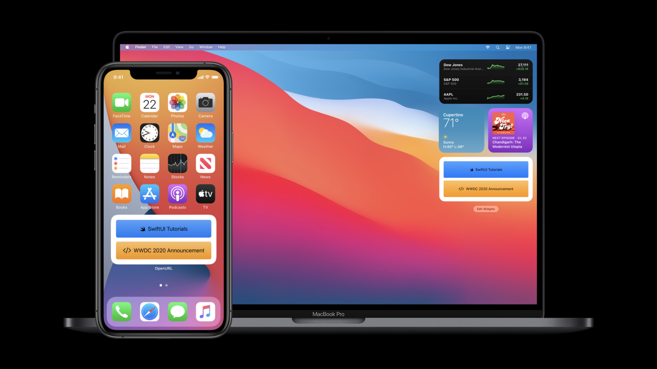
App、Scene、DocumentGroup、Widget、List(children:)、LazyVGrid、ToolbarItem、matchedGeometryEffect、Link、openURL、UTType和SignInWithAppleButton接入同一套声明式模型,让应用入口、窗口、文档、小组件、复杂列表、工具栏、动画和系统服务都能用 SwiftUI 直接实现。
核心内容
SwiftUI 第一年的重点是 View。开发者可以写声明式界面,但完整 App 还要处理入口、窗口、菜单、文档、列表性能、工具栏、辅助功能和系统服务。这个 session 的任务,是把这些日常工作收回到 SwiftUI 的声明式模型里。
(01:14)开场先给出一个完整 App:@main 标记入口,App 的 body 返回 Scene,WindowGroup 承载 View。系统会按平台规则把这段声明映射成 iOS 的全屏窗口、iPadOS 的多窗口、macOS 的多窗口和菜单命令。
(09:18)第二个问题是内容规模。普通列表和手写导航很快会碰到层级数据、网格内容和滚动性能。SwiftUI 2020 加入 outline、lazy grid 和 lazy stack,让图库、侧边栏和递归列表都能继续用数据驱动的写法表达。
(12:19)最后一部分回到平台体验。工具栏、Label、帮助提示、键盘快捷键、进度控件、Gauge、matched geometry、动态字体缩放、Link、openURL、Uniform Type Identifiers(统一类型标识)和 Sign in with Apple 都有 SwiftUI 入口。开发者不需要离开 SwiftUI,就能接入这些系统能力。
详细内容
1. App 和 Scene 变成 SwiftUI 的入口
(01:26)官方展示的第一个片段就是一个完整 App。App 协议和 WindowGroup 把应用入口写成和 View 类似的声明式结构。
@main
struct HelloWorld: App {
    var body: some Scene {
        WindowGroup {
            Text("Hello, world!").padding()
        }
    }
}
关键点:
@main标记应用入口,替代传统模板里的手工生命周期入口。HelloWorld遵守App,body返回的是Scene。WindowGroup是这里的 Scene;transcript 说明它会在不同平台上提供对应窗口行为。Text("Hello, world!").padding()是窗口里的 SwiftUI View。
(04:46)macOS 上还可以组合 Settings Scene。系统会设置标准偏好设置菜单,并给窗口正确的样式。
@main
struct BookClubApp: App {
    @StateObject private var store = ReadingListStore()

    @SceneBuilder var body: some Scene {
        WindowGroup {
            ReadingListViewer(store: store)
        }

    #if os(macOS)
        Settings {
            BookClubSettingsView()
        }
    #endif
    }
}

struct BookClubSettingsView: View {
    var body: some View {
        Text("Add your settings UI here.")
            .padding()
    }
}
关键点:
@StateObject把阅读列表存储放在 App 层,由窗口中的 View 观察。@SceneBuilder允许一个 App 声明多个 Scene。WindowGroup负责主窗口。Settings只在 macOS 编译,负责偏好设置窗口。
2. DocumentGroup 接管文档打开、编辑和保存
(05:10)文档型 App 使用 DocumentGroup。transcript 说明它会自动管理打开、编辑、保存文档场景,在 iOS、iPadOS 和 macOS 上可用。
import SwiftUI
import UniformTypeIdentifiers

@main
struct ShapeEditApp: App {
    var body: some Scene {
        DocumentGroup(newDocument: ShapeDocument()) { file in
            DocumentView(document: file.$document)
        }
    }
}

struct DocumentView: View {
    @Binding var document: ShapeDocument

    var body: some View {
        Text(document.title)
            .frame(width: 300, height: 200)
    }
}

struct ShapeDocument: Codable {
    var title: String = "Untitled"
}

extension UTType {
    static let shapeEditDocument =
        UTType(exportedAs: "com.example.ShapeEdit.shapes")
}

extension ShapeDocument: FileDocument {
    static var readableContentTypes: [UTType] { [.shapeEditDocument] }

    init(fileWrapper: FileWrapper, contentType: UTType) throws {
        let data = fileWrapper.regularFileContents!
        self = try JSONDecoder().decode(Self.self, from: data)
    }

    func write(to fileWrapper: inout FileWrapper, contentType: UTType) throws {
        let data = try JSONEncoder().encode(self)
        fileWrapper = FileWrapper(regularFileWithContents: data)
    }
}
关键点:
DocumentGroup(newDocument:)定义新文档默认值。file.$document把文档内容作为 binding 传给DocumentView。UTType(exportedAs:)声明应用自己的文件类型。FileDocument的init和write负责读取与写出文档数据。
(05:49)文档 App 还可以加菜单命令。commands 会把自定义菜单放进平台合适的位置,keyboardShortcut 显示快捷键。
DocumentGroup(newDocument: ShapeDocument()) { file in
    DocumentView(document: file.$document)
}
.commands {
    CommandMenu("Shapes") {
        Button("Add Shape...", action: addShape)
            .keyboardShortcut("N")
        Button("Add Text", action: addText)
            .keyboardShortcut("T")
    }
}
关键点:
commands挂在 Scene 上,不挂在单个 View 上。CommandMenu("Shapes")创建自定义菜单。- 两个
Button分别绑定动作。 keyboardShortcut为菜单项声明键盘快捷键。
3. 列表、网格和 lazy stack 处理大量内容
(09:22)List 新增 children key path,可以直接展示递归层级数据。这个能力减少了内容型 App 里频繁 push-and-pop 的导航。
struct OutlineContentView: View {
    var graphics: [Graphic]

    var body: some View {
        List(graphics, children: \.children) { graphic in
            GraphicRow(graphic)
        }
        .listStyle(SidebarListStyle())
    }
}

struct Graphic: Identifiable {
    var id: String
    var name: String
    var icon: Image
    var children: [Graphic]?
}
关键点:
List(graphics, children: \.children)读取每个节点的子节点。Graphic的children是可选数组,对应可展开或叶子节点。SidebarListStyle()使用侧边栏样式。- 每个节点仍然用普通 SwiftUI View 渲染。
(10:09)网格使用 lazy-loading 布局。GridItem(.adaptive(minimum: 176)) 会按可用宽度调整列数。
struct ContentView: View {
    var items: [Item]

    var body: some View {
        ScrollView {
            LazyVGrid(columns: [GridItem(.adaptive(minimum: 176))]) {
                ForEach(items) { item in
                    ItemView(item: item)
                }
            }
            .padding()
        }
    }
}
关键点:
ScrollView提供滚动容器。LazyVGrid只按需要加载网格内容。GridItem(.adaptive(minimum: 176))让列数跟随空间变化。ForEach(items)把数据数组映射成单元格。
(10:58)自定义长列表可以用 LazyVStack。官方图库示例还展示了 view builder 支持 switch,可以在同一个 stack 中切换多种布局。
struct WildlifeList: View {
    var rows: [ImageRow]

    var body: some View {
        ScrollView {
            LazyVStack(spacing: 2) {
                ForEach(rows) { row in
                    switch row.content {
                    case let .singleImage(image):
                        SingleImageLayout(image: image)
                    case let .imageGroup(images):
                        ImageGroupLayout(images: images)
                    case let .imageRow(images):
                        ImageRowLayout(images: images)
                    }
                }
            }
        }
    }
}
关键点:
LazyVStack适合自定义滚动布局。switch row.content按数据类型选择不同 View。SingleImageLayout、ImageGroupLayout和ImageRowLayout共同组成不规则图库。- transcript 明确说这些内容组合后形成 seamless gallery。
4. 工具栏、Label、帮助提示和新控件统一平台交互
(12:24)SwiftUI 新增 toolbar modifier。工具栏项可以是普通 View,默认放在平台习惯的位置。
struct ContentView: View {
    var body: some View {
        List {
            Text("Book List")
        }
        .toolbar {
            Button(action: recordProgress) {
                Label("Record Progress", systemImage: "book.circle")
            }
        }
    }

    private func recordProgress() {}
}
关键点:
toolbar挂在 View 上,内部放工具栏内容。Button是普通 SwiftUI 控件。Label同时提供标题和图标。- transcript 说明工具栏会在平台默认位置展示。
(12:40)需要控制位置时使用 ToolbarItem。它可以声明 semantic placement,例如主操作、确认操作、取消操作和 principal 位置。
struct ContentView: View {
    var body: some View {
        List {
            Text("Book List")
        }
        .toolbar {
            ToolbarItem(placement: .primaryAction) {
                Button(action: recordProgress) {
                    Label("Record Progress", systemImage: "book.circle")
                }
            }
        }
    }

    private func recordProgress() {}
}
关键点:
ToolbarItem包住一个工具栏控件。.primaryAction描述控件角色。- SwiftUI 根据平台决定具体位置。
Label在工具栏中默认展示图标,标题用于辅助功能。
(15:28)help modifier 在 macOS 上变成工具提示,也会提供 accessibility hint。
struct ContentView: View {
    var body: some View {
        Button(action: recordProgress) {
            Label("Progress", systemImage: "book.circle")
        }
        .help("Record new progress entry")
    }

    private func recordProgress() {}
}
关键点:
help描述控件效果。- macOS 会把它呈现为 Tool Tips。
- transcript 说明它在所有平台也提供 VoiceOver hint。
(17:08)新控件覆盖进度和容量表达。ProgressView 表示确定或不确定进度,Gauge 表示某个值相对容量的位置。
struct ContentView: View {
    var percentComplete: Double

    var body: some View {
        ProgressView("Downloading Photo", value: percentComplete)
    }
}
关键点:
percentComplete是确定进度值。ProgressView同时接收标题和进度。- transcript 说明它有 linear 和 circular 两种样式。
5. 动画、响应式视觉和系统服务有直接 SwiftUI API
(19:17)matchedGeometryEffect 把两个区域里的同一个元素连接起来。示例中,专辑从网格移动到选中行时,SwiftUI 会插值 frame,形成连续过渡。
struct ContentView: View {
    @Namespace private var namespace
    @State private var selectedAlbumIDs: Set<Album.ID> = []

    var body: some View {
        VStack(spacing: 0) {
            ScrollView {
                albumGrid.padding(.horizontal)
            }

            Divider().zIndex(-1)

            selectedAlbumRow
                .frame(height: AlbumCell.albumSize)
                .padding(.top, 8)
        }
        .buttonStyle(PlainButtonStyle())
    }

    private var albumGrid: some View {
        LazyVGrid(columns: [GridItem(.adaptive(minimum: AlbumCell.albumSize))], spacing: 8) {
           ForEach(unselectedAlbums) { album in
              Button(action: { select(album) }) {
                 AlbumCell(album)
              }
              .matchedGeometryEffect(id: album.id, in: namespace)
           }
        }
    }

    private var selectedAlbumRow: some View {
        HStack {
            ForEach(selectedAlbums) { album in
                AlbumCell(album)
                .matchedGeometryEffect(id: album.id, in: namespace)
            }
        }
    }
}
关键点:
@Namespace提供几何匹配的命名空间。- 两处
matchedGeometryEffect使用相同的album.id。 - 网格和选中行共享同一组标识。
withAnimation(.spring(response: 0.5))出现在官方完整片段中,用来触发选择动画。
(20:34)响应式排版也增强了。自定义字体会随 Dynamic Type 缩放,非文本 metric 可以用 @ScaledMetric。
struct ContentView: View {
    var album: Album
    @ScaledMetric private var padding: CGFloat = 10

    var body: some View {
        VStack {
            Text(album.name)
                .font(.custom("AvenirNext-Bold", size: 30))

            Text("\(Image(systemName: "music.mic")) \(album.artist)")
                .font(.custom("AvenirNext-Bold", size: 17))

        }
        .padding(padding)
        .background(RoundedRectangle(cornerRadius: 16, style: .continuous).fill(Color.purple))
    }
}
关键点:
@ScaledMetric让padding跟随 Dynamic Type。- 自定义字体继续使用
.font(.custom(...))。 Image(systemName:)可以嵌入Text,并作为文本的一部分响应字号变化。
(23:15)系统集成部分先讲 Link 和 openURL。Link 会打开 URL 或 universal link,openURL 用于从 View 环境中以代码触发打开。
let customPublisher = NotificationCenter.default.publisher(for: .init("CustomURLRequestNotification"))
let apple = URL(string: "https://developer.apple.com/tutorials/swiftui/")!

struct ContentView: View {
    @Environment(\.openURL) private var openURL

    var body: some View {
        Text("OpenURL Environment Action")
            .onReceive(customPublisher) { output in
                if output.userInfo!["shouldOpenURL"] as! Bool {
                    openURL(apple)
                }
            }
    }
}
关键点:
@Environment(\.openURL)读取环境里的打开 URL 动作。onReceive监听 publisher。- 条件满足后调用
openURL(apple)。 - transcript 说明 SwiftUI 会相对包含它的窗口打开 URL。
(25:16)Sign in with Apple 也有 SwiftUI 控件。只要同时导入 AuthenticationServices 和 SwiftUI,就能使用它。
import AuthenticationServices
import SwiftUI

struct ContentView: View {
    var body: some View {
        SignInWithAppleButton(
            .signUp,
            onRequest: handleRequest,
            onCompletion: handleCompletion
        )
        .signInWithAppleButtonStyle(.black)
    }

    private func handleRequest(request: ASAuthorizationAppleIDRequest) {}
    private func handleCompletion(result: Result<ASAuthorization, Error>) {}
}
关键点:
SignInWithAppleButton来自 AuthenticationServices 和 SwiftUI 的组合。.signUp指定按钮用途。onRequest和onCompletion处理授权请求与结果。.signInWithAppleButtonStyle(.black)设置官方样式。
核心启发
- 做一个多窗口阅读或资料管理 App:用
App、WindowGroup和@StateObject放置共享模型,让同一套 SwiftUI 入口覆盖 iPhone、iPad、Mac、Apple Watch 和 Apple TV。开始时先照 BookClub 结构搭入口,再给 macOS 加SettingsScene。 - 做一个简单文档编辑器:用
DocumentGroup管理打开、编辑和保存,用FileDocument读写模型,用UTType(exportedAs:)声明文件类型。第一版只需要一个标题字段和一个DocumentView,再用commands增加菜单动作。 - 做一个能承载大量内容的图库:用
LazyVGrid做自适应网格,用LazyVStack处理不规则长列表,用matchedGeometryEffect给项目移动加连续动画。起步可以复用官方专辑选择器结构,把数据换成图片或视频缩略图。 - 给生产 App 补齐平台交互细节:用
toolbar、ToolbarItem、Label、help和keyboardShortcut把常用操作放到平台合适的位置。先从一个详情页开始,把保存、取消、分享和主操作分别映射到对应 placement。 - 把系统能力接进 SwiftUI 页面:用
Link处理教程、新闻或 App 内 universal link,用openURL响应异步事件,用SignInWithAppleButton放入登录流程。第一步先把外链和登录按钮做成独立 SwiftUI View,再嵌入现有页面。
关联 Session
- App essentials in SwiftUI — 继续讲 App、Scene、View、WindowGroup、Settings 和应用入口的结构。
- Build document-based apps in SwiftUI — 深入
DocumentGroup、FileDocument和文档型 App 管理。 - Stacks, Grids, and Outlines in SwiftUI — 展开本 session 提到的 outline、lazy grid 和 lazy stack。
- Build SwiftUI views for widgets — 补充 WidgetKit 中 SwiftUI 小组件视图的构建方式。
- Build complications in SwiftUI — 继续处理 Apple Watch complication 的 SwiftUI 自定义视图。
评论
GitHub Issues · utterances