
Highlight
Session 用 Starstruck 示例展示
UIAccessibility的按钮形状、颜色区分、Bold Text、Reduce Motion、Cross-fade 和 Reduce Transparency 检查点,让 App 的颜色、字号、动效和透明背景随用户视觉偏好调整。
核心内容
很多 App 的视觉层级从颜色开始:红色代表错误,蓝色代表可点,浅色背景上放一层半透明模糊。对视力正常的人,这些选择很自然。对色弱、低视力、光敏感或动效敏感的用户,同一套界面可能会丢失关键信息。
这场 session 用一个星座 App Starstruck 作为线索,把问题拆成三组:颜色和形状、文字可读性、显示偏好。讲者没有把无障碍当成最后补一层标签,而是从按钮、Tab、列表 cell、图片、动画和 blur 这些日常 UI 元素开始,逐个检查默认设计会在哪里失效。
Apple 给出的做法也很直接。先用系统颜色、SF Symbols、Asset Catalog 的高对比度资源减少手工适配;再通过 UIAccessibility 读取用户设置;如果默认设计无法满足这些设置,就监听通知并切换到另一套更清楚的表现。这样做的结果是:同一份界面可以保留品牌视觉,也能尊重用户在系统里已经表达过的视觉需求。
详细内容
颜色和形状:不要只靠颜色传达含义
(03:14)iOS 14 为 Button Shapes 提供了新的 UIAccessibility API。讲者的建议是:如果默认设计没有按钮外形,就在这个设置打开时提供替代表现。
func observeButtonShapesNotification() {
    // Make buttons more visible by using shapes.
    // If your default design does not include button shapes, observe this notification to make visual changes.
    NotificationCenter.default.addObserver(self, selector: #selector(updateButtonShapes), name: UIAccessibility.buttonShapesEnabledStatusDidChangeNotification, object: nil)
}

@objc func updateButtonShapes() {
    if UIAccessibility.buttonShapesEnabled {
        // Use extra visualizations for buttons.
    } else {
        // Use default design for buttons.
    }
}
关键点:
buttonShapesEnabledStatusDidChangeNotification让 App 在设置变化时立即更新界面。UIAccessibility.buttonShapesEnabled是当前状态,适合在更新方法里分支。- 替代表现应当让按钮更像按钮,例如增加边框、背景或其他形状提示。
(03:31)Differentiate Without Color 处理的是更常见的问题:状态 icon、彩色文字、列表中的分类标识,都不能只靠颜色表达含义。讲者建议从 SF Symbols 开始,因为符号可以随文字大小和字重缩放。
func observeDifferentiateWithoutColorNotification() {
    // Use symbols or shapes to convey meaning instead of relying on color alone.
    // If your default design does not differentiate without color, observe this notification to make visual changes.
    NotificationCenter.default.addObserver(self, selector: #selector(updateColorAndSymbols), name: NSNotification.Name(UIAccessibility.differentiateWithoutColorDidChangeNotification), object: nil)
}

@objc func updateColorAndSymbols() {
    if UIAccessibility.shouldDifferentiateWithoutColor {
        // Use symbols or shapes to convey meaning.
    } else {
        // Use default design.
    }
}
关键点:
shouldDifferentiateWithoutColor打开时,颜色旁边要增加符号、形状或文字。- 这段代码适用于错误状态、选中状态、分类标签这类原本靠颜色区分的 UI。
- transcript 中的 Starstruck 示例把每个星座从纯颜色区分改成颜色加符号,避免色弱用户失去分类信息。
对比度和 Smart Invert:让系统设置接管外观变化
(05:17)颜色仍然可以使用,但要检查对比度。讲者演示了 Xcode Accessibility Inspector 的 Color Contrast Calculator:普通外观里白色符号和紫色背景的比例是 4.5:1,高对比度资源把背景变暗后达到 7.5:1。Asset Catalog 可以为同一个 symbol 提供 High Contrast 外观,Increase Contrast 打开后由系统自动切换。
(07:47)Smart Invert Colors 会对界面施加反色效果,但照片、视频、App icon 这类内容通常应保持原貌。UIKit 的入口是 UIView.accessibilityIgnoresInvertColors。
extension UIView {
    @available(iOS 11.0, tvOS 11.0)
    var accessibilityIgnoresInvertColors: Bool { get set }
}
关键点:
- 这个属性设置在任意
UIView子类上。 - 适用对象是照片、视频、App icon 等不应被反色的内容。
- transcript 把 Smart Invert 和 Dark Mode 区分开:Smart Invert 是系统设置,会覆盖任何 App 的界面。
大字号:布局要跟着内容尺寸变化
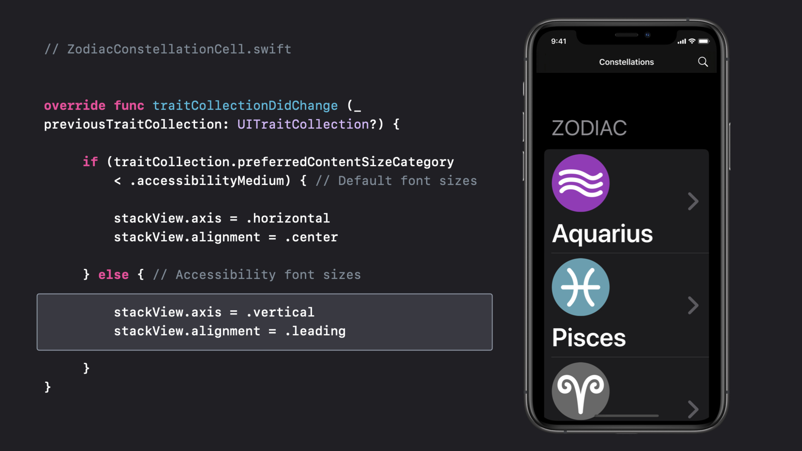
(09:57)Dynamic Type 的核心问题不是把字体变大就结束。字号进入 accessibility size 后,原本横向排列的图标和文字会互相挤压。Starstruck 的做法是在 traitCollectionDidChange 里读取 preferredContentSizeCategory,把 cell 从横向布局切到纵向布局。
// ZodiacConstellationCell.swift


override func traitCollectionDidChange (_ previousTraitCollection: UITraitCollection?) {

     if (traitCollection.preferredContentSizeCategory
         < .accessibilityMedium) { // Default font sizes

         stackView.axis = .horizontal
         stackView.alignment = .center

     } else { // Accessibility font sizes

         stackView.axis = .vertical
         stackView.alignment = .leading

     }
}
关键点:
traitCollectionDidChange会在设备显示特征变化时调用。preferredContentSizeCategory < .accessibilityMedium用来区分默认字号和辅助功能字号。- 默认字号下继续用横向布局,内容密度更高。
- 辅助功能字号下改成纵向布局,让 label 使用完整宽度。
- transcript 还强调 label 的 line count 应设为
0,这样长文本可以继续换行。
Bold Text:系统字体自动处理,定制字体要自己响应
(11:33)如果使用系统 font styles,系统会处理 Bold Text。自定义字体或自定义字重需要读取 UIAccessibility.isBoldTextEnabled,并监听对应通知。
func observeBoldTextNotification() {
    // Update labels to use bold or heavy font styles.
    // If you aren't using system font styles, observe this notification to make visual changes.
    NotificationCenter.default.addObserver(self, selector: #selector(updateLabelWeight), name: UIAccessibility.boldTextStatusDidChangeNotification, object: nil)
}

@objc func updateLabelWeight() {
    if UIAccessibility.isBoldTextEnabled {
        // Use bold or heavy font weight
    } else {
        // Use font weight that is default to your design.
    }
}
关键点:
boldTextStatusDidChangeNotification用于实时响应设置变化。isBoldTextEnabled打开时,自定义字体应切到 bold 或 heavy。- transcript 中的用法是让 title label 和 detail label 有更清楚的视觉区分。
动效和透明度:尊重用户对运动和背景复杂度的选择
(13:08)Starstruck 有一个视差效果,用 UIMotionEffect 让星星前景和宇宙背景产生深度。对动效敏感的人,这类效果可能造成不适。Reduce Motion 打开后,App 应减少或移除频繁、强烈、装饰性的运动。
func observeReduceMotionNotification() {
    // Observe this notification to reduce or remove the frequency and intensity of motion effects.
    NotificationCenter.default.addObserver(self, selector: #selector(updateMotionEffects), name: UIAccessibility.reduceMotionStatusDidChangeNotification, object: nil)
}

@objc func updateMotionEffects() {
    if UIAccessibility.isReduceMotionEnabled {
        // Reduce or remove extraneous motion effects.
    } else {
        // Use default motion effects.
    }
}
关键点:
isReduceMotionEnabled应在执行强动效前检查。reduceMotionStatusDidChangeNotification让已打开的页面也能调整动效。- transcript 给出的替代范围包括 idle animation、parallax、auto-playing videos、GIFs 和 slide transitions。
(13:51)iOS 14 还新增了 Prefer Cross-Fade Transitions API。使用 UINavigationController 的默认滑动转场时,系统会处理这件事;自定义 slide transition 需要自己检查设置。
func observeCrossFadeTransitionsNotification() {
    // Reduce or remove sliding animations for transitioning views.
    // If you aren't using system-provided navigation, observe this notification to make visual changes.
    NotificationCenter.default.addObserver(self, selector: #selector(updateTransitionEffects), name: UIAccessibility.prefersCrossFadeTransitionsStatusDidChange, object: nil)
}

@objc func updateTransitionEffects() {
    if UIAccessibility.prefersCrossFadeTransitions {
        // Replace sliding transitions with cross-fade animations.
    } else {
        // Use default sliding transitions.
    }
}
关键点:
prefersCrossFadeTransitions打开时,把滑动转场换成 cross-fade。- 默认 UIKit navigation 已经覆盖常见路径。
- 自定义转场、游戏菜单或全屏流程需要显式处理。
(15:07)Reduced Transparency 会把 blur 和 vibrancy 调整为不透明效果。系统 visual effects 会自动适配;自定义透明背景需要检查 UIAccessibility.isReduceTransparencyEnabled。
func observeReduceTransparencyNotification() {
    // Reduce or remove transparency by adjusting these effects to be completely opaque.
    // If you aren't using system-provided visual effects for blurs or vibrancy, observe this notification to make visual changes.
    NotificationCenter.default.addObserver(self, selector: #selector(updateTransparencyEffects), name: UIAccessibility.reduceTransparencyStatusDidChangeNotification, object: nil)
}

@objc func updateTransparencyEffects() {
    if UIAccessibility.isReduceTransparencyEnabled {
        // Make transparency effects opaque.
    } else {
        // Use default transparency.
    }
}
关键点:
- blur 背景可能让文字对比度随背景变化,低视力用户会更难阅读。
reduceTransparencyStatusDidChangeNotification适合切换自定义背景材质。- 关闭透明度不代表取消层级,可以改用纯色、边框和间距维持信息结构。
核心启发
-
做一个无障碍状态组件库。 做什么:把错误、成功、警告、选中这些状态统一做成颜色加符号加文字的组合。为什么值得做:session 明确要求不要只靠颜色传达含义,SF Symbols 可以随文字大小和字重缩放。怎么开始:先监听
differentiateWithoutColorDidChangeNotification,在shouldDifferentiateWithoutColor打开时显示符号或形状。 -
给列表 cell 增加大字号布局。 做什么:为消息列表、订单列表、健康数据列表准备一套 accessibility size 布局。为什么值得做:transcript 里的 Starstruck 把图标和 label 从横向改成纵向,让文字拿到完整宽度。怎么开始:在 cell 的
traitCollectionDidChange里比较preferredContentSizeCategory,超过.accessibilityMedium后调整 stack view 的 axis 和 alignment。 -
建立显示偏好测试面板。 做什么:在 debug 菜单里列出 Button Shapes、Bold Text、Reduce Motion、Reduce Transparency 触发后的预期 UI。为什么值得做:session 结尾建议开发者亲自打开这些设置,找出 App 已经工作良好和需要修复的区域。怎么开始:把每个
UIAccessibility状态封装成只读检查项,并链接到对应页面的视觉检查清单。 -
替换高风险动效。 做什么:给视差、滑动转场、自动播放动画准备低运动版本。为什么值得做:transcript 提到 parallax、idle animation、GIF 和 slide transition 都可能影响动效敏感用户。怎么开始:执行动画前检查
isReduceMotionEnabled和prefersCrossFadeTransitions,把装饰性运动换成淡入淡出或静态状态。 -
把 blur 背景做成可降级样式。 做什么:为信息卡、底部浮层、半透明导航栏提供不透明背景。为什么值得做:Reduced Transparency 会把系统 blur 调成纯色,自定义 blur 需要自己处理。怎么开始:监听
reduceTransparencyStatusDidChangeNotification,在isReduceTransparencyEnabled打开时切到纯色背景,并重新检查文字对比度。
关联 Session
- App accessibility for Switch Control — 继续从辅助功能角度检查 App 的交互结构,重点是 Switch Control 用户如何扫描和触发界面元素。
- VoiceOver efficiency with custom rotors — 讲解如何用 custom rotors 帮 VoiceOver 用户在复杂界面里更快导航。
- Accessibility design for Mac Catalyst — 把 iPad App 带到 Mac 时,补上键盘、鼠标、元素分组和 Accessibility Inspector 测试流程。
- The details of UI typography — 深入文字可读性,补充系统字体、Dynamic Type、自定义字体和排版细节。
- SF Symbols 2 — 补充符号系统的设计和代码使用方式,适合配合 Differentiate Without Color 改造状态表达。
评论
GitHub Issues · utterances